
Todo List App: How to Choose One You'll Actually Keep Using
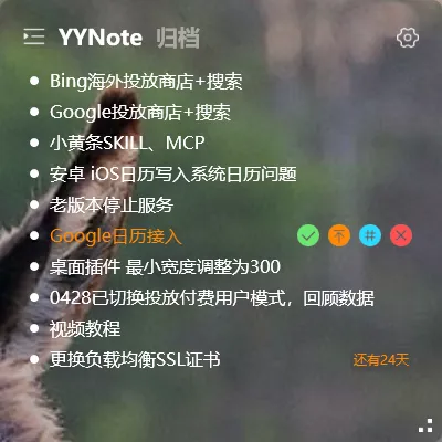
Quick answer: A todo list app earns long-term use when it does five things well: it stays visible on your screen without being opened, adding a task takes a few seconds, it creates no distractions of its own, it sits beside your calendar and notes on one screen, and it syncs across every device you sign into. YYNote’s desktop todo widget was designed around exactly these five criteria — a transparent floating checklist that lives on your wallpaper and stays out of your way.
Why criteria beat feature lists
Section titled “Why criteria beat feature lists”The typical way people shop for a todo list app — comparing feature tables — predicts very little about whether the app survives past the opening month. Industry surveys consistently show that a large share of downloaded productivity apps are opened a handful of times and then quietly abandoned, and the pattern repeats year after year. The reason is rarely a missing feature. Apps get dropped because they ask too much: open the app, find the list, remember to check it, and tolerate the noise it adds.
A better way to choose is to test a candidate against behavioral criteria that decide whether the app fits into your day instead of fighting it. The five criteria below cover visibility, capture speed, attention cost, context, and continuity. Each one comes with a note on how YYNote’s desktop todo list widget addresses it, drawn from the product as it ships today.
Criterion 1: The list stays visible without being opened
Section titled “Criterion 1: The list stays visible without being opened”A todo list that hides inside an app depends on you remembering to open it. Industry surveys consistently show that reminder systems placed outside a person’s habitual line of sight lose effectiveness within days, because checking them requires an act of memory — the very thing a todo list is meant to support. Visibility is therefore the opening test: can you see your tasks without launching, switching, or unlocking anything?
YYNote passes this test by design. Its todo list is a widget: a transparent floating window embedded into the desktop layer itself, sitting on the wallpaper rather than inside an application frame. When your computer starts, the list is already there — no dock icon, no launch, no decision to make. For the step-by-step setup on Windows, see how to put a todo list on the Windows desktop, which walks through placing the widget where your eyes already rest.
Criterion 2: Adding a task takes seconds
Section titled “Criterion 2: Adding a task takes seconds”The moment you think of a task is fragile. Industry surveys consistently show that the longer the gap between thinking of a task and recording it, the higher the chance it is never captured at all — and every extra tap, field, or required category widens that gap. Apps that demand project labels, priorities, and due dates up front turn a two-second capture into a form-filling exercise, and the tasks you never typed are the ones you forget.
Test this before committing to any app: time yourself adding a plain task. If the flow involves nested menus, the capture cost is too high for real life. YYNote’s widget keeps capture lean — the list lives on the screen you already see, so recording a task means a trip to your desktop, not a hunt through menus. The unit is the plain task: a line of text you can tick when it is done. That simplicity is not a limitation; it is the reason the list stays honest, because everything on it got there in seconds.
Criterion 3: It creates no new distractions of its own
Section titled “Criterion 3: It creates no new distractions of its own”A todo list is supposed to reduce mental load, yet many apps arrive with feeds, badges, streaks, and promotional banners living in the same window as your tasks. Every one of those elements competes for the attention the list was meant to protect. Open such an app to check one item and you leave having read notifications you never asked for; the tool itself has become an interruption.
The test here is subtraction, not addition: what does the app remove from your attention? YYNote’s answer is the desktop widget format itself. The todo list sits in the desktop layer and does not push itself forward; it is there when you look and silent when you do not. There is no feed to scroll and nothing to clear. The widget settings panel lets you toggle and adjust what appears, so the surface you keep is the surface you chose. Because the list greets you at boot without demanding interaction, it informs your day instead of interrupting it.
Criterion 4: Tasks, calendar, and notes share one screen
Section titled “Criterion 4: Tasks, calendar, and notes share one screen”Tasks do not live in isolation. A reminder to submit a report belongs next to the deadline; a shopping list belongs next to the note about what the fridge is missing. When each of those lives in a separate app, your day is spread across windows, and reconciling them is unpaid work. Industry surveys consistently show that people who keep tasks, schedule, and notes in separate tools report more friction and more missed items than those who keep them side by side.
So the fourth criterion is coexistence: does the app share a screen with the rest of your planning surface? YYNote’s todo widget runs on the same desktop layer as its transparent sticky notes, desktop calendar, weather and time display, and date countdown — all visible together on the wallpaper, without burying it. The shape of your week on the calendar, the tasks beneath it, the notes beside it: one look covers all three. To build that combined surface, the desktop todo list widget guide covers how the pieces coexist, and the desktop notes guide does the same for the sticky notes beside your list.
Criterion 5: Everything syncs across your devices
Section titled “Criterion 5: Everything syncs across your devices”A list you can see on your desk but not on your laptop or phone fragments into several half-truths. You end up maintaining duplicates or trusting a version you cannot see, and both habits erode a checklist’s usefulness. Continuity is the quiet criterion: sign in on another device and the same list should already be there.
YYNote treats sync as a baseline rather than an upgrade path. One account keeps the todo widget consistent across your devices, so a task checked off in one place is checked off everywhere. That matters above, too — the widget stays simple precisely because the system behind it does the consistent bookkeeping.
A five-point audit you can run today
Section titled “A five-point audit you can run today”Before settling on any todo list app, watch your own behavior for a week and score it:
- Visibility. Did you see your tasks today without opening anything? If the answer requires a launch, the app starts each day in deficit.
- Capture speed. Add three tasks right now. Anything slower than a few seconds per task will fail on a busy day.
- Attention cost. What did the app show you that you did not ask for? Every badge and feed item counts against it.
- Context. Can today’s tasks, your calendar, and your notes occupy one screen, or does your day live in separate windows?
- Continuity. Sign in on a second device. If the list does not match, the system is already splitting.
YYNote’s desktop todo widget maps one-to-one onto those tests: a transparent widget embedded in the desktop layer, plain and fast capture, no feed of its own, coexistence with sticky notes, calendar, weather and time, and date countdown widgets, and account-level sync underneath. Whether it suits your workflow is yours to judge — but this yardstick predicts long-term use far better than a feature table.
What makes a todo list app worth keeping?
Section titled “What makes a todo list app worth keeping?”Visibility, capture speed, low attention cost, shared context, and sync. An app that passes those five tests fits into your day instead of adding a new obligation to it; one that fails the opening two tends to be dropped within weeks.
How does YYNote’s desktop todo list widget work?
Section titled “How does YYNote’s desktop todo list widget work?”It is a transparent floating window embedded into the desktop layer, so it sits on your wallpaper rather than inside an app frame. Tasks appear as lines you can check off when done, the widget is visible from the moment the computer starts, and a settings panel lets you toggle and adjust it. It coexists on the same desktop with transparent sticky notes, a desktop calendar, a weather and time display, and a date countdown.
Does YYNote sync across devices, and can I try it?
Section titled “Does YYNote sync across devices, and can I try it?”Yes — one account keeps your todo list consistent across your devices. New registrations come with a 7-day membership trial, so you can run the five-point audit above for a full week before deciding.
How much does YYNote cost?
Section titled “How much does YYNote cost?”Membership is priced at 30 CNY for 3 months, 88 CNY a year, 188 CNY for 3 years, or 288 CNY for 5 years.